TUFLOW CATCH Tutorial M01 Results QGIS: Difference between revisions
Jump to navigation
Jump to search
Content deleted Content added
| (19 intermediate revisions by 2 users not shown) | |||
| Line 1: | Line 1: | ||
<font color="red"><font size=18>Page Under Construction</font></font> |
|||
== Introduction == |
== Introduction == |
||
Review the TUFLOW CATCH timeseries outputs: |
Review the TUFLOW CATCH timeseries outputs: |
||
| Line 6: | Line 5: | ||
** Groundwater: Cumulative groundwater water flow and associated pollutant masses leaving the TUFLOW HPC model and entering the receiving polygon. |
** Groundwater: Cumulative groundwater water flow and associated pollutant masses leaving the TUFLOW HPC model and entering the receiving polygon. |
||
** Total: The combined data from the above surface water and groundwater mass balance outputs. |
** Total: The combined data from the above surface water and groundwater mass balance outputs. |
||
* Receiving polygon inflows and concentrations |
* Receiving polygon instantaneous inflows and concentrations as a timeseries. |
||
Additionally, review the TUFLOW HPC mesh results (.xmdf file) using the <u>[[TUFLOW_Viewer | TUFLOW Viewer]]</u>. |
Additionally, review the TUFLOW HPC mesh results (.xmdf file) using the <u>[[TUFLOW_Viewer | TUFLOW Viewer]]</u>. |
||
| Line 13: | Line 12: | ||
<ol> |
<ol> |
||
<li> In Windows File Explorer, navigate to the '''TUFLOWCATCH\bc_dbase''' folder and open '''TC01_001_catchment_hydraulic_receiving.csv'''. |
<li> In Windows File Explorer, navigate to the '''TUFLOWCATCH\bc_dbase''' folder and open '''TC01_001_catchment_hydraulic_receiving.csv'''. |
||
<li> This file contains incoming flow and concentrations at |
<li> This file contains incoming flow and pollutant concentrations at 5-minute intervals, as defined by the <tt><font color=blue>Catch BC Output Interval Lateral </font><font color=red>==</font> 300</tt> command in the .tcc.<br> |
||
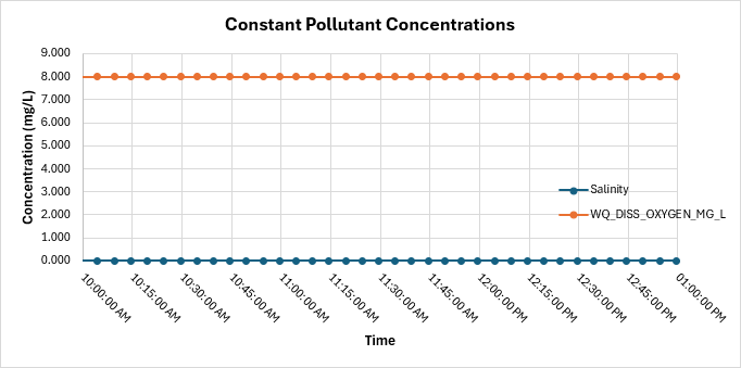
<li> Salinity and dissolved oxygen are |
<li> Salinity and dissolved oxygen are constant pollutants. As such, their corresponding output values should be constant throughout the simulation. <br> |
||
<br> |
<br> |
||
[[File: |
[[File: TC1_constant_pollutants_vs_time_01b.png]]<br> |
||
<br> |
<br> |
||
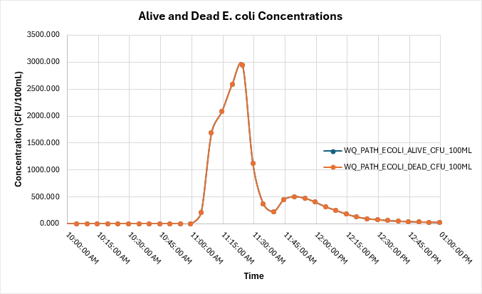
<li> Alive and dead E coli have been defined with the same pollutant export parameters, so their outputs should be |
<li> Alive and dead E. coli have been defined with the same pollutant export parameters, so their outputs should be the same. <br> |
||
<br> |
<br> |
||
[[File: |
[[File: TC1_ecoli_vs_time_01b.png]]<br> |
||
<br> |
<br> |
||
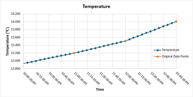
<li>Temperature has been provided as a timeseries with four input data points ('''temperature.csv'''). TUFLOW CATCH has interpolated these to produce temperatures at each timestep in the output timeseries file.<br> |
|||
| ⚫ | |||
<br> |
<br> |
||
[[File: TC1_temp_vs_time_01b.png]]<br> |
|||
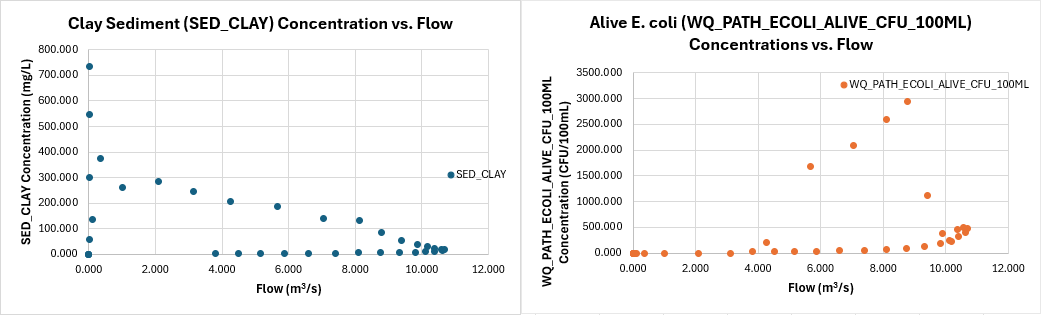
[[File: graph of flow vs pollutant concentrations, pathogens on separate graph]]<br> |
|||
| ⚫ | |||
| ⚫ | |||
| ⚫ | |||
[[File: TC1_flow_vs_pollutants_01b.png]]<br> |
|||
<br> |
<br> |
||
:'''Note:''' The pathogen concentrations are plotted on a logarithmic scale. |
|||
</ol> |
</ol> |
||
| Line 32: | Line 34: | ||
<ol> |
<ol> |
||
<li> In Windows File Explorer, navigate to the '''TUFLOWCATCH\bc_dbase''' folder and open '''TC01_001_catchment_hydraulic_mass_balance.csv'''. |
<li> In Windows File Explorer, navigate to the '''TUFLOWCATCH\bc_dbase''' folder and open '''TC01_001_catchment_hydraulic_mass_balance.csv'''. |
||
<li> This file contains the total |
<li> This file contains the total surface and groundwater flow (m³) and associated pollutant masses leaving the TUFLOW HPC model and entering the receiving polygon ('''2d_rp_TC01_001_R'''). Outputs are written at the same interval as '''TC01_001_catchment_hydraulic_receiving.csv'''.<br> |
||
<li> No groundwater has been simulated in the model, |
<li> No groundwater has been simulated in the model, so those flows will be zero. |
||
| ⚫ | |||
[[File: ]]<br> |
|||
| ⚫ | |||
</ol> |
</ol> |
||
== TUFLOW HPC Map Results == |
== TUFLOW HPC Map Results == |
||
Review the TUFLOW HPC Map outputs with TUFLOW Viewer: |
Review the TUFLOW HPC Map outputs with the TUFLOW Viewer:<br> |
||
:'''Note:''' For further guidance on how to plot, view and style results, please refer to <u>[[TUFLOW_Viewer | TUFLOW Viewer]]</u>. |
|||
<ol> |
<ol> |
||
<li> Load the '''2d_mat_TC01_001.shp''' layer from the '''TUFLOW\model\gis''' folder into QGIS. |
<li> Load the '''2d_mat_TC01_001.shp''' layer from the '''TUFLOW\model\gis''' folder into QGIS. |
||
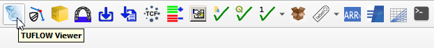
<li>Open TUFLOW Viewer from the TUFLOW Plugin toolbar.<br> |
<li>Open the TUFLOW Viewer from the TUFLOW Plugin toolbar.<br> |
||
<br> |
<br> |
||
[[File:tuflow_plugin_tuflow_viewer.png]]<br> |
[[File:tuflow_plugin_tuflow_viewer.png]]<br> |
||
<br> |
<br> |
||
<li>Open the simulation results. Select File > Load Results - Map Outputs. Navigate to the '''TUFLOWCATCH\results''' folder and select '''TC01_001_catchment_hydraulic.xmdf'''. |
<li>Open the simulation results. Select File > Load Results - Map Outputs. Navigate to the '''TUFLOWCATCH\results''' folder and select '''TC01_001_catchment_hydraulic.xmdf'''. |
||
<li>In the TUFLOW Viewer panel, select 'Conc SED_CLAY' from the Result Type list. |
<li>In the TUFLOW Viewer panel, select 'Conc SED_CLAY' from the Result Type list. Output concentration values often vary significantly, which can make result interpretation difficult. Adjusting the symbology to have a smaller concentration range, as shown in the video below, improves visibility.<br> |
||
<br> |
<br> |
||
{{Video|name=}}<br> |
{{Video|name=animation_TC1_results_01b.mp4|width=1432}}<br> |
||
<li>Review the pollutant concentrations of clay and E. coli throughout the model simulation. |
<li>Review the pollutant concentrations of clay and E. coli throughout the model simulation. Observe how the water moves across different material regions. |
||
:'''Note:''' The symbology of 'Conc WQ_PATH_ECOLI_ALIVE_CFU_100ML' has been updated similarly to above. |
|||
<br> |
<br> |
||
{{Video|name=}}<br> |
{{Video|name=animation_TC1_results_02b.mp4|width=1432}}<br> |
||
<li>Zoom in to the downstream end of the model. Use the Plot Time Series tool to see the pollutant concentrations at various locations around the receiving polygon. These time series concentrations should be similar to the '''TC01_001_catchment_hydraulic_receiving.csv''' output. |
<li>Zoom in to the downstream end of the model. Use the Plot Time Series tool to see the pollutant concentrations at various locations around the receiving polygon. These time series concentrations should be similar to the '''TC01_001_catchment_hydraulic_receiving.csv''' output. <br> |
||
<br> |
<br> |
||
{{Video|name=}}<br> |
{{Video|name=animation_TC1_results_03a.mp4|width=1432}}<br> |
||
<li>Select 'Dry Mass WQ_PATH_ECOLI_ALIVE_CFU_100ML' from the result type list. This is the dry mass of the accumulated alive E. coli. Notice that at the start of the simulation, there is no dry mass, but as the model continues, the dry mass accumulates on the paddocks, and then |
<li>Select 'Dry Mass WQ_PATH_ECOLI_ALIVE_CFU_100ML' from the result type list. This is the dry mass of the accumulated alive E. coli. Notice that at the start of the simulation, there is no dry mass, but as the model continues, the dry mass accumulates on the paddocks, and then reduces when rainfall occurs. <br> |
||
<br> |
<br> |
||
{{Video|name=}}<br> |
{{Video|name=animation_TC1_results_04a.mp4|width=1432}}<br> |
||
</ol> |
</ol> |
||
Latest revision as of 09:51, 3 July 2025
Introduction
Review the TUFLOW CATCH timeseries outputs:
- Mass balance files
- Surface water: Cumulative surface water flow and associated pollutant masses leaving the TUFLOW HPC model and entering the receiving polygon.
- Groundwater: Cumulative groundwater water flow and associated pollutant masses leaving the TUFLOW HPC model and entering the receiving polygon.
- Total: The combined data from the above surface water and groundwater mass balance outputs.
- Receiving polygon instantaneous inflows and concentrations as a timeseries.
Additionally, review the TUFLOW HPC mesh results (.xmdf file) using the TUFLOW Viewer.
TUFLOW CATCH Timeseries Outputs
Review the time series data for the receiving polygon:
- In Windows File Explorer, navigate to the TUFLOWCATCH\bc_dbase folder and open TC01_001_catchment_hydraulic_receiving.csv.
- This file contains incoming flow and pollutant concentrations at 5-minute intervals, as defined by the Catch BC Output Interval Lateral == 300 command in the .tcc.
- Salinity and dissolved oxygen are constant pollutants. As such, their corresponding output values should be constant throughout the simulation.
- Alive and dead E. coli have been defined with the same pollutant export parameters, so their outputs should be the same.
- Temperature has been provided as a timeseries with four input data points (temperature.csv). TUFLOW CATCH has interpolated these to produce temperatures at each timestep in the output timeseries file.
- When plotting flow against pollutant concentrations, a noticeable spike appears once the dry store release threshold is reached, followed by a gradual decline for the remainder of the simulation.


Review the mass balance time series data:
- In Windows File Explorer, navigate to the TUFLOWCATCH\bc_dbase folder and open TC01_001_catchment_hydraulic_mass_balance.csv.
- This file contains the total surface and groundwater flow (m³) and associated pollutant masses leaving the TUFLOW HPC model and entering the receiving polygon (2d_rp_TC01_001_R). Outputs are written at the same interval as TC01_001_catchment_hydraulic_receiving.csv.
- No groundwater has been simulated in the model, so those flows will be zero.
TUFLOW HPC Map Results
Review the TUFLOW HPC Map outputs with the TUFLOW Viewer:
- Note: For further guidance on how to plot, view and style results, please refer to TUFLOW Viewer.
- Load the 2d_mat_TC01_001.shp layer from the TUFLOW\model\gis folder into QGIS.
- Open the TUFLOW Viewer from the TUFLOW Plugin toolbar.
- Open the simulation results. Select File > Load Results - Map Outputs. Navigate to the TUFLOWCATCH\results folder and select TC01_001_catchment_hydraulic.xmdf.
- In the TUFLOW Viewer panel, select 'Conc SED_CLAY' from the Result Type list. Output concentration values often vary significantly, which can make result interpretation difficult. Adjusting the symbology to have a smaller concentration range, as shown in the video below, improves visibility.
- Review the pollutant concentrations of clay and E. coli throughout the model simulation. Observe how the water moves across different material regions.
- Note: The symbology of 'Conc WQ_PATH_ECOLI_ALIVE_CFU_100ML' has been updated similarly to above.
- Zoom in to the downstream end of the model. Use the Plot Time Series tool to see the pollutant concentrations at various locations around the receiving polygon. These time series concentrations should be similar to the TC01_001_catchment_hydraulic_receiving.csv output.
- Select 'Dry Mass WQ_PATH_ECOLI_ALIVE_CFU_100ML' from the result type list. This is the dry mass of the accumulated alive E. coli. Notice that at the start of the simulation, there is no dry mass, but as the model continues, the dry mass accumulates on the paddocks, and then reduces when rainfall occurs.

| Up |
|---|